THE CHALLENGE
Pillars Website Struggled with Usability Issues that Negatively Impacted Enrollment and Engagement.
Pillars' aim was to have an inclusive and user-friendly website that would effectively enhance school engagement and enrollment. However, the prior website's limited functionality and design hindered its ability to attract and effectively engage prospective parents.
THE SOLUTION
An updated and visually appealing website that improved the user experience and visual aesthetics in order to attract more prospective parents, and ultimately drive enrollment at Pillars Academy.
In order to do this my team and I:
Conducted prototype creation and usability testing to identify the highest priority minimum viable products (MVPs) for user improvement on the website.
Implemented a Hi-Fi mockup redesign based on the findings from the testing phase.
Updated the Style Guide and Component Libraries to align with the new design and functionality of the website.
Prepared comprehensive Dev Handoff documentation for seamless transition and implementation by the development team.
OVERVIEW
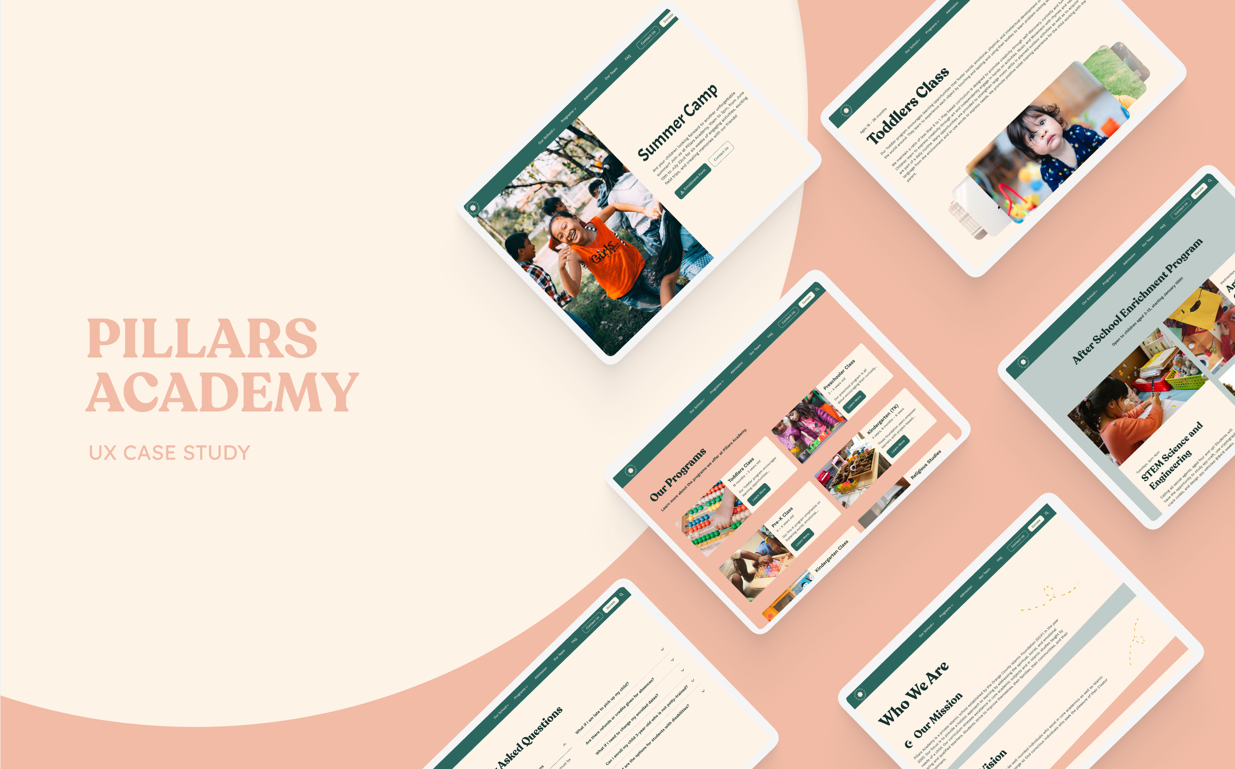
Pillars Academy: Nurturing Minds, Inspiring Futures
Pillars Academy is an Islamic, non-profit private school committed to holistic learning and its aim is to have a modern and attractive website that effectively caters to the needs of prospective parents seeking a safe and nurturing environment for their children.
Table of Contents
Process
Discovery
Usability Testing
Redesign
Dev Handoff
Duration
14 months
Tools
Procreate
Figma
Miro
UserTesting.com
Role
UX/UI Designer
UX Researcher
DISCOVERY
KICK-OFF MEETING
Client Desired an Attractive Website that would Generate Leads and Increase Enrollment.
Through discussions with the client, we gained valuable insights into the school's priorities and the dislikes of the current website design, which helped us understand and define success metrics in order to create an intuitive platform that met their goals of increasing school engagement and enrollment.

EXSISTING WEBSITE
Current Digital Assets
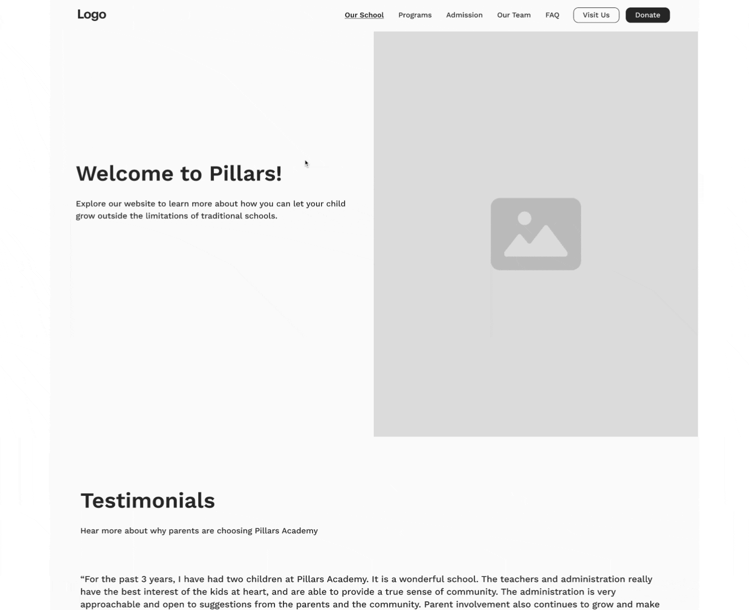
Pillars had mid-fidelity wireframes from an external source but no branding or live website yet. This gave me a lot of room to work with the design system after gaining insight from usability interviews.

RESEARCH
Usability Testing
For this usability testing, my objective was to test if Pillars Academy’s website was user-friendly enough for users to gather information about the school’s mission and the programs it offers for its students, as well as if it was easy to contact the school.
We developed a prototype of the website and planned to conduct usability testing to assess the overall user experience of four key user flows:
(1) As a user, I want to be able to see the main (home) page that provides a summary of what the academy is
(2) As a user, I want to be able to learn more about Pillars Academy and its mission.
(3) As a user, I want to be able to see all that Pillars Academy has to offer for its programs (Toddlers, Preschool, Pre-K, Kindergarten, Religious Studies, and Extracurriculars).
(4) As a user, I want to be able to contact the Pillar Academy by submitting a form.
Participants were tested on Usertesting.com using unmoderated user testing, and the findings below were used to improve the application.

Usability Testing Key Findings
-
70% of users were frustrated during completing a task due to the program’s dropdown hover inconsistencies.
-
-Users recommended a search box to find information faster
-
-Users were confused on how to contact the school due to wording on CTA buttons
-Users wanted the option of a phone number in the contact form area.
REDESIGN
USABILITY TESTING SOLUTIONS
-
Issue:
The initial prototype encountered functionality problems, particularly with the dropdown menu, leading to user frustration and task completion obstacles.
Solution:
I discovered that the external team responsible for the original prototype had overlooked implementing auto layout and smart animation. Addressing this issue, I ensured that the dropdown menu functioned smoothly, activating upon mouse entry into the designated dimensions.
Before
After
Before
After
-
Pillars experienced a loss of enrollment leads due to a confusingly labeled button with contact information, as users were unable to locate how to reach the school to apply during interviews. To address this issue, I recommended changing the wording from "Visit Us" to "Contact Us" for clarity and improved usability.
Before
After

-
Usability interviews revealed a common desire among users for search functionality on the website, particularly among busy parents seeking quick access to specific information due to the site's extensive content.


REDESIGN
DESIGN SYSTEM
Finalizing the Design System
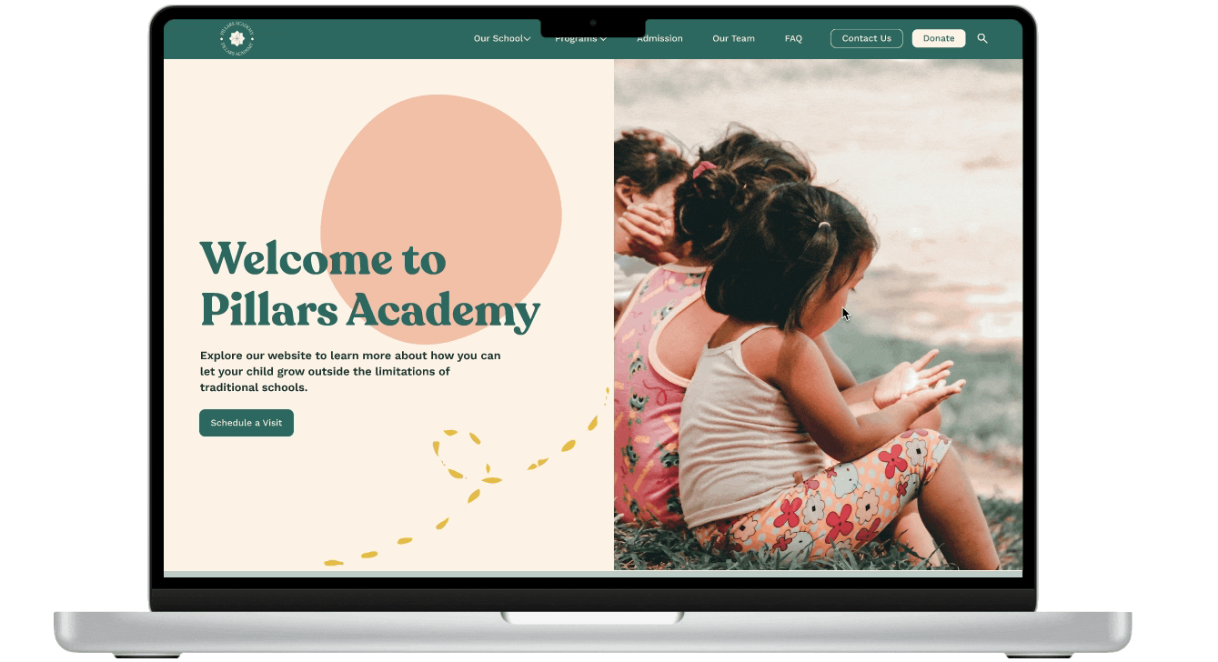
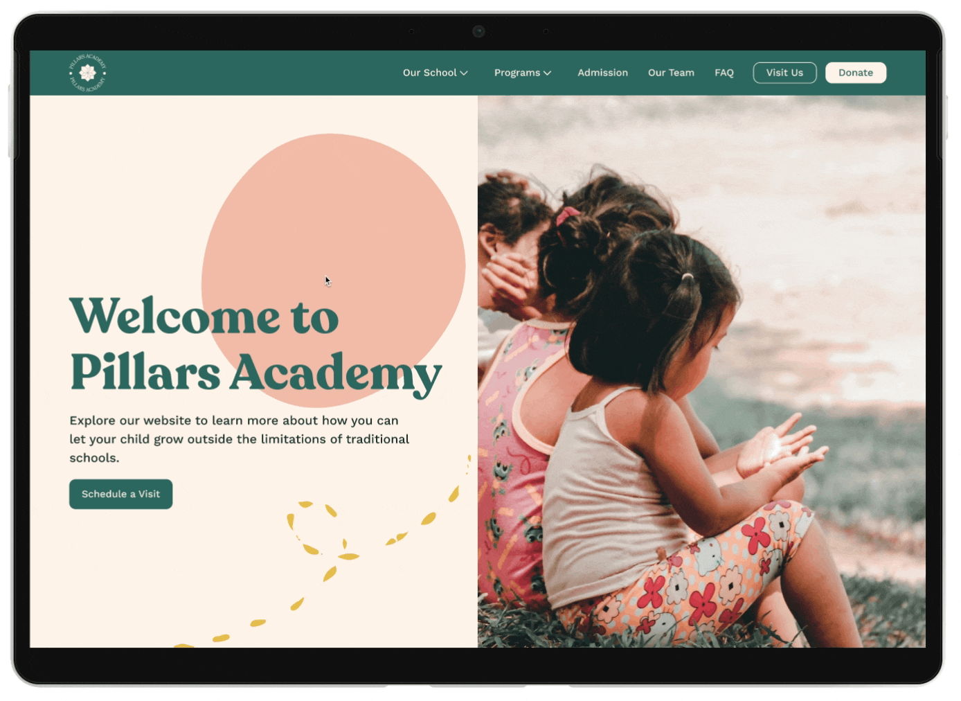
Given the freedom in branding, I opted for warm, childlike colors and imagery to resonate with the school's image and give parents a sense of dependability. Subsequently, we developed and integrated text, color, and grid styles into the Figma library to ensure consistency across designs.


FINAL UI AND PROTOTYPE
Putting all the Puzzle Pieces Together
After getting approval for the UX/UI changes and updated style guide from the client we finished adding final UI elements.
Additionally, we created this prototype replicating the look and feel of the future live website for the client.
-
![]()
Who we are Page
-
![]()
Admissions Page
-
![Navigation & Buttons]()
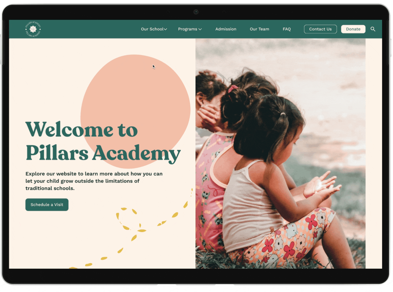
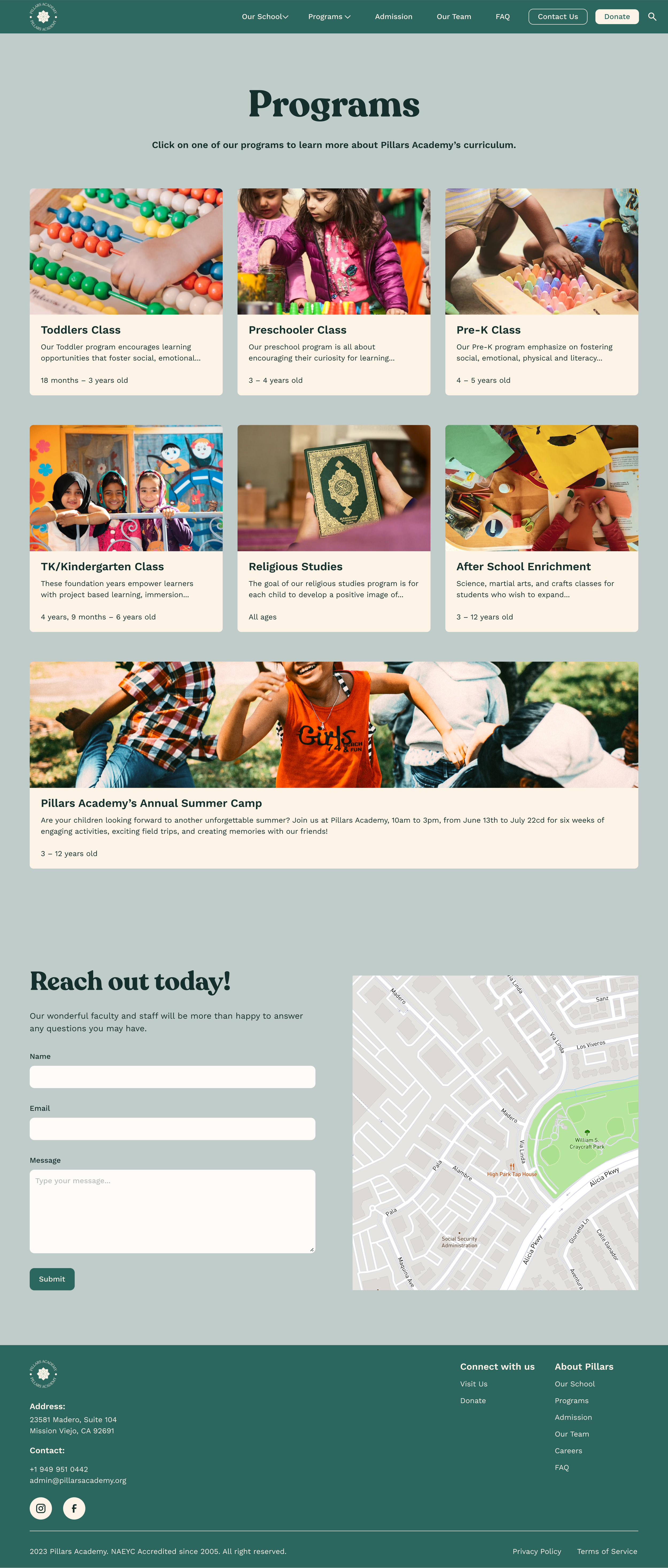
Programs Page
-
![]()
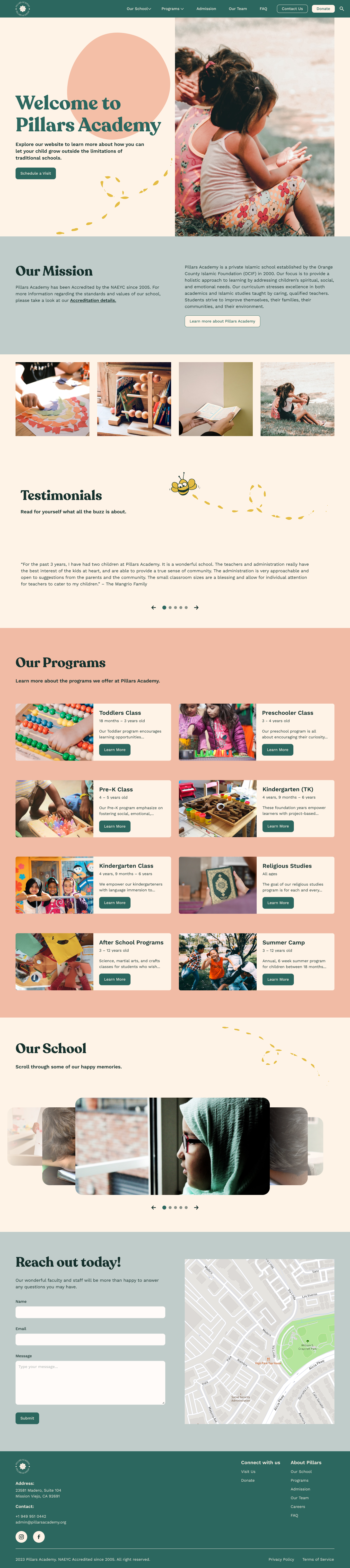
Homepage
-
![]()
Summer Camp


DEVELOPER HANDOFF
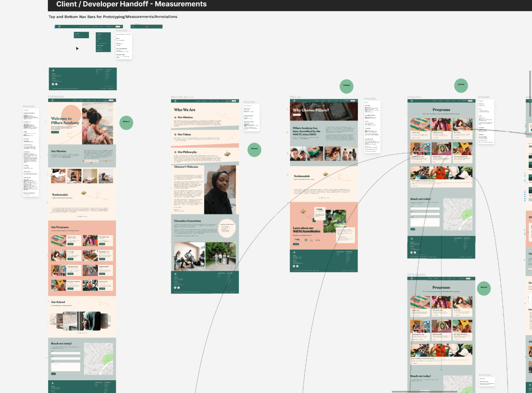
With more than 20 screens across the website, the inclusion of comprehensive measurements, detailed annotations, and clear flowcharts became paramount for us to send off to the development team.
We utilized design plugins such as Measure and Annotate It that are designed to accurately measure pixel dimensions and annotate design elements. This approach ensured meticulous documentation, including detailed notes on each element's purpose and function, enhancing clarity and facilitating seamless collaboration between the design and development teams.
REFLECTIONS
Challenges
Behind every great project is a great team and being on a team always has challenges. Here are a few for this project:
The nemesis aka Timezones: collaborating ideas and changes with time zones was a big obstacle until our team utilized methods that helped combat this such as establishing clear and efficient communication channels to keep everyone connected and updated as well as utilizing project management software, ensuring a continuous workflow.
If I had more time and budget, I would have conducted iterative testing after the hi-fi redesign phase. Iterative testing would have allowed us to gather valuable feedback from users and make necessary refinements to further improve the user experience.
Takeaways
I worked with an exceptional team for this project and It is truly gratifying to see the client's satisfaction with the results, knowing that our work has positively impacted Pillars Academy's ability to engage with parents and achieve their goals.